Creative Policy
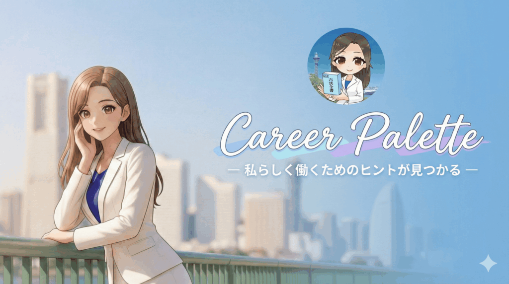
The creative direction for the thumbnails of Soten Integrated Legal Office can be summarized in a single phrase: "A high-quality elegance where trust and innovation coexist with an inclusive sense of security." While various thumbnail archetypes common on platforms like YouTube can be potent weapons for attracting attention, for our office—which demands a balance between the professional dignity of a national qualification and a pioneering spirit in cutting-edge fields such as DX and AI—those styles alone are either too aggressive or insufficient.
Our desired direction begins with a "visual anchor": an intelligent and cheerful woman set against the Yokohama cityscape as our iconic symbol. She is not merely a model, but the embodiment of a "partner" (companion) who breaks through complex legal and technical barriers to lead clients toward a bright future. The vast blue sky of Yokohama symbolizes our office name, "Soten" (Azure Sky), providing a regional sense of trust and permanence essential for fields like immigration support and real estate law. Complementing this, an SD character logo holding a Roppo Zensho (Compendium of Laws) is added as a "seal of quality assurance." This neutralizes the rigidity typical of the legal profession, creating an approachable atmosphere where entrepreneurs and individuals feel comfortable seeking consultation.
Regarding color schemes, we avoid "violent" purples and yellows, adopting trustworthy Navy and clean White as our base. In accordance with innovative fields such as Generative AI and drone law, we gracefully add "gold and light accents that evoke the future." This clearly establishes our position not as a traditional, "old-fashioned" legal office, but as modern professionals who master technology to resolve problems with exceptional speed and precision.
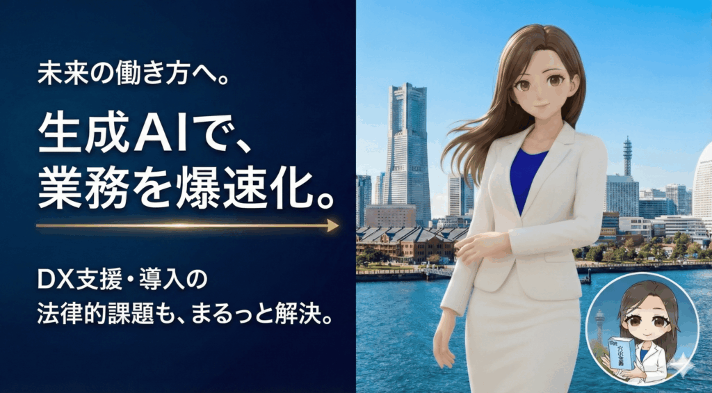
For layout, we utilize a template with logical and clear headings on the left and a reassuring person on the right. Font selection incorporates the aesthetic sense found in lifestyle media, prioritizing legibility while maintaining a refined and sophisticated "airiness" (nukekan). In tech-related contexts, we utilize modern, geometric sans-serif fonts with intellectual, thin profiles to project innovation. We will never stoke the anxiety of viewers nor tell self-indulgent stories; instead, we deliver positive messages that allow viewers to imagine their current problems being resolved smartly. To ensure visibility, we will reduce background clutter, apply filters, or add drop shadows and glows to text as necessary.
Our office has long faced the challenge of identifying the optimal balance between professional authority and marketing KPIs, such as click-through and conversion rates. However, by merging all the elements mentioned above, we strive to make our thumbnails a presence of overwhelming intelligence and warmth within the chaotic markets of YouTube and other social media. We infuse each image with a refreshing and powerful brand identity—like looking up into the azure sky. This is the unique creative strategy of Soten Integrated Legal Office, defined from the perspective of legal professionals.
January 20, 2026
Soichiro Iwata
Certified Administrative Procedures Specialist
蒼天総合法務事務所のサムネイル制作の方向性は、一言で言えば、「信頼と革新が同居する、包容力ある上質感」に集約されるべきでしょう。YouTube等にありがちな各サムネイルの類型は、いずれも視聴者の注意を引くうえでは強力な武器となり得るものですが、国家資格者としての威厳と、DXやAIといった先端領域を扱う先取性の両立を求める弊事務所にとっては、そのどれもが単体では劇薬か、あるいは力不足でした。
弊事務所が目指すべき方向性は、まず視覚的なアンカーとして、「横浜の街並みを背負った知的で朗らかな女性」を事務所の象徴的なアイコンに据えることから始まります。彼女は単なるモデルではなく、複雑な法務や技術の壁を突破し、依頼者を明るい未来へと導く「伴走者」の化身です。背景に広がる横浜の青空は、事務所名である「蒼天」そのものを象徴し、外国人の在留支援や不動産法務に不可欠な「この場所に根を張っている」という地域的な信頼感を与えます。ここに、六法全書を手にしたSDキャラクターのロゴを「品質保証の刻印」のように添えることで、士業特有の堅苦しさを中和し、起業家や個人が「この先生なら話しやすそうだ」と感じる親しみやすさを演出します。
配色においては、暴力的な紫や黄色は避け、誠実さを表すネイビーと清潔なホワイトを基調ととします。そこに、生成AIやドローン法務といった革新的な業務内容に合わせて、「未来を感じさせるゴールドや光のアクセント」を品よく加えることとします。これにより、単なる従来型の「古い法律家」ではなく、「テクノロジーを使いこなして爆速で課題を解決する現代的なプロフェッショナル」としての立ち位置を明確に示します。
文字の配置については、左側に論理的で分かりやすい見出しを、右側に安心感を与える人物を配置する構成をテンプレート化します。ただし、フォント選びには、ライフスタイル系のサムネイルに見られたような「美意識」を採り入れ、視認性を保ちつつも洗練された「抜け感」を大切にします。テクノロジーを扱う場面においては、モダンで幾何学的なサンセリフ体の中から知的な細身のものを選択することにより革新性を演出します。決して閲覧者・視聴者らの不安を煽るのではなく、また、独りよがりな物語を語るのでもなく、視聴者が抱える「現状の悩み」を「スマートに解決した後の自分」を想像させるような、前向きなメッセージを発信することとします。視認性の確保については、必要に応じて、背景の情報量を減らす、背景にフィルターをかける、テキストにドロップシャドウや光彩を加えることとします。
弊事務所としては、かねてより、士業としての専門性・権威性と、クリック率・コンバージョン率といったマーケティング面からのKPIの現実的な落としどころの特定という課題を抱えておりました。しかし、既にお伝えしたすべての要素を融合させることにより、弊事務所のサムネイルを、YouTubeその他SNSという混沌とした市場において、静かながらも圧倒的な知性と温もりを放つ存在とすることに努めます。蒼天を仰ぐような爽やかで力強いブランドアイデンティティを、一枚一枚の画像に宿していくこと。それが、法律家の立場から定義する、蒼天総合法務事務所が歩むべき唯一無二のクリエイティブ戦略です。
2026年1月20日
特定行政書士
岩田 崇一郎

パパ、絶対こんなこと言わないよ!
Daddy would never say something like that!
先生はGeminiの下請になるんだって♪
I heard Boss is gonna be a subcontractor for Gemini!♪